受付中のセミナー

2026年8月25日(火) 10:00~17:00 (交流会 18:00 - )
KFC Hall& Rooms 東京・両国
AI半導体の次なる市場 -光電融合からフィジカルAI、ロボティックスへ、その材料との接点-
| 参加費 | カワサキテクノリサーチコンサルティング会員:44,000円(税込)、 テック・アンド・ビズ紹介:44,000円(税込)、 一般:55,000円 (税込) |
|---|---|
| キーワード | 材料開発, 機械設計, サステナビリティ, 電動化 |

2026年7月31日 14:00~15:00
オンライン
人権・環境DDの業務とは!~OECDガイダンスに基づく基本的要件から欧州電池規則、CSDDDの個別要件まで徹底解説~
| 参加費 | 無料 |
|---|---|
| キーワード | 人権DD, 環境DD, ESG, CSDDD, CFP, データ連携, サプライチェーン排出量, Scope3, 欧州電池規則, CBAM, EUBR, 自動車LCA, ELV規制 |

過去のセミナー

2026年7月16日(木) 13:00-15:45 2026年7月17日(金) 13:00-15:45
オンライン(eventhub)
Battery Next 2026 バッテリーの今と未来を語る、オンラインカンファレンス
| 参加費 | 無料 |
|---|---|
| キーワード | 次世代電池, 全固体電池 |

2026年7月2日 15:00~16:10
オンライン
Notified Body登壇!
欧州電池規則の最新動向と要求事項に対する備えについて
| 参加費 | 無料 |
|---|---|
| キーワード | 欧州電池規則, CFP算定, 人権・環境DD, デジタルバッテリーパスポート, 適合性評価, Notified Body, EV電池, LMT電池, CFP性能クラス, リサイクル材含有率 |

2026年6月30日(火) 10:00-11:00
オンライン(eventhub)
なぜ技術は“属人化”するのか — 元トヨタのトップ指導者が語る、継承と改善が進む組織のつくり方
| 参加費 | 無料 |
|---|---|
| キーワード | 製造業, 技術継承, トヨタ |

2026年6月29日(月) 9:00-15:00
オンライン(eventhub)
製造業AI実装フォーラム2026
主催:ストックマーク株式会社
| 参加費 | 無料 |
|---|---|
| キーワード | AI, DX |

2026年6月25日 14:00~15:00
オンライン
CBAM担当者必見!体化排出量の算定・連携からモニタリングレポートの作成まで徹底解説!
| 参加費 | 無料 |
|---|---|
| キーワード | CBAM, 炭素国境調整措置, 体化排出量, Embedded Emissions, 排出量算定, 鉄鋼, EU ETS, EU規制対応, サプライチェーン管理, CO₂排出量算定 |

2026年6月25日(木) 10:00-10:45
オンライン(eventhub)
なぜ同じ失敗は繰り返されるのか?技術継承が進まない組織の共通点
| 参加費 | 無料 |
|---|---|
| キーワード | 製造業, 技術継承 |

2026年6月25日(木)
オンライン
「TechXchange」
Envalior Engineering Materials Forum 2026
| 参加費 | 無料 |
|---|---|
| キーワード | 材料開発, 機械設計, サステナビリティ, 電動化 |

2026年6月18日(木) 10:00-11:00 2026年6月19日(金) 10:00-11:00
オンライン(eventhub)
イラン情勢・供給不安の時代に、製造業はどう戦うべきか
— トヨタの危機管理経験に学ぶ、設計・品質・コスト最適化の実践論
| 参加費 | 無料 |
|---|---|
| キーワード | 製造業, イラン情勢, 危機管理 |

2026年5月26日 10:30~12:00
オンライン
Catena-Xの最新動向!~Catena-XにおけるCFP算定ルール、Catena-X認定、現場データを活用したPCFの在り方までを一挙解説~
| 参加費 | 無料 |
|---|---|
| キーワード | Catena-X, Product Carbon Footprint, 自動車, Carbon Foot Print, データプラットフォーム, 欧州電池規則 |
2026年5月14日(木) 13:00 ~ 15:00
オンライン(zoom)
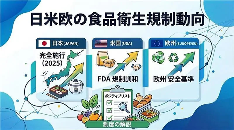
日米欧の食品用器具・容器包装における ポジティブリスト制度の最新動向
| 参加費 | 1名につき44,000円 、 2名同時申し込み・無料会員登録など割引の特典あり |
|---|---|
| キーワード | ポジティブリスト制度, 食品用器具・容器包装 |

2026年5月13日(水)12:15 - 13:00
インテックス大阪
ラベル台紙の水平リサイクル事業「資源循環プロジェクト」
主催:RX Japan
| 参加費 | 無料(事前申込要) |
|---|---|
| キーワード | 資源循環, サーキュラーエコノミー |

2026年3月11日(水) 13:30-14:30
APイノゲート大阪 or オンライン
第6回 資源循環プロジェクト公式説明会( 主催:資源循環プロジェクト事務局)
| 参加費 | 無料 |
|---|---|
| キーワード | 資源循環プロジェクト, サーキュラーエコノミー |
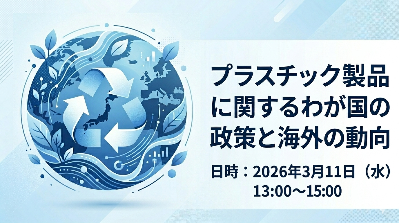
2026年3月11日(水) 13:00~15:00
オンライン(zoom)
プラスチック製品に関するわが国の政策と海外の動向
| 参加費 | 一般:¥3,300 |
|---|---|
| キーワード | 資源循環, バイオプラスチック |
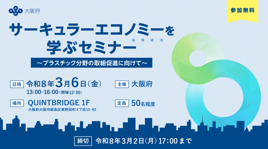
2026年3月6日(金)13:00 - 16:00
QUINTBRIDGE(大阪市都島区東野田町4丁目15-82)
「サーキュラーエコノミーを学ぶセミナー」
~プラスチックス分野の取組促進に向けて~
| 参加費 | 無料 |
|---|---|
| キーワード | 資源循環, サーキュラーエコノミー |

2026年2月27日(金)13:00-20:00
京都大学 北部総合教育研究棟 益川ホール 〒606-8267 京都府京都市左京区北白川追分町 京都大学 吉田キャンパス 北部構内
サーキュラーマテリアルシンポジウム
ー材料の未来を循環から描き出すー
| 参加費 | 10,000円 |
|---|---|
| キーワード | SDGs, サーキュラーマテリアル |

2026年2月13日(金) 13:00~16:30
東京・品川区大井町 きゅりあん 4階 第1グループ活動室
ケミカルリサイクル拡大に向けた分解性を有するプラスチック材料設計技術 ~光触媒反応で効率的に分解可能なプラスチックの分子設計技術~
| 参加費 | 49,500円 ( E-Mail案内登録価格 46,970円 ) ※S&T会員登録とE-Mail案内登録特典について ※E-Mail案内登録なら、2名同時申込みで1名分無料 2名で49,500円 (2名ともE-Mail案内登録必須/1名あたり定価半額24,750円) |
|---|---|
| キーワード | 環境問題, ケミカルリサイクル |

2026年2月10日(火) 13:00~17:00
ナガセグローバル人材開発センター(東京都渋谷区千駄ヶ谷4丁目8-13)
激変するプラスチック業界を勝ち抜く、「視座」と「技術」
| 参加費 | 無料 |
|---|---|
| キーワード | 石化業界, 金型, 成形メーカー, トラブルシューティング |

2025年12月19日(金)13:30~16:40
ナゴヤイノベーターズガレージ 及び オンライン
R7年度 第2回ICETT資源循環セミナー
循環性向上に向けた製品設計の今とこれから
| 参加費 | 無料(定員:現地30名、オンライン480名) |
|---|---|
| キーワード | 資源循環, サーキュラーエコノミー |

【開催日時】2025年12月10日(水) 14:00~15:00 【申込締切】2025年12月8日(月)
オンライン
ESG経営の実践 価値向上のためのSDGs活用
~2030年その先に求められるもの
持続可能性を企業価値に変える経営戦略~
| 参加費 | 無料 |
|---|---|
| キーワード | ESG, CSV |

令和7年12月2日(火)13:00~17:40(受付開始 12:15)
大阪工業大学 梅田キャンパス OIT梅田タワー 常翔ホール (大阪市北区茶屋町1番45号)※会場とオンラインのハイブリッド形式で実施します。
カーボンニュートラル先進技術フォーラム
| 参加費 | 無料 |
|---|---|
| キーワード | 水素, 蓄電池, カーボンニュートラル |
2025年11月28日(金)14:00 - 16:40
宇都宮市文化会館 小ホール
令和7年度 排出事業者における産業廃棄物の適正処理及び排出抑制に関する講習会
~サーキュラーエコノミー(循環経済)への移行に向けて~
| 参加費 | 無料(先着400名) |
|---|---|
| キーワード | 資源循環, サーキュラーエコノミー |

2025年11月27日(木) 10:00AM~11:30AM
ZOOMウェビナー
<第10回 KTR注目テーマ報告会(ウェビナー)>~テーマは、「世界最大の複合材展レポート」と「光電融合」~
| 参加費 | 無料(コンサルティング会員3名まで)、5,000円(税抜き、非会員) |
|---|---|
| キーワード | 複合材料リサイクル, JEC WORLD 2025, カワサキテクノリサーチ |

2025年11月26日(水)10:00–19:00 (9:45-受付開始)
長瀬産業㈱東京本社(TOKYO TORCH 常盤橋タワー13階/東京都千代田区大手町2丁目6−4)
plaplat バイオマテリアル Day @常盤橋
| 参加費 | 無料 |
|---|---|
| キーワード | バイオマス, プラスチック, 添加剤, バイオプラスチック製品 |
開催日:2025年10月30日(木)15:00-16:00 申込期日: 2025年10月29日(水)13:00
オンライン
「環境規制強化に備える!GHG・CFP算定の基本と最新動向」~企業の脱炭素対応に向けた実務の第一歩~
| 参加費 | 無料 |
|---|---|
| キーワード | GHG, CFP |
開催日: 2025年10月21日(火) 10:00~11:15 申込期日: 2025年10月20日(月) 18:00
ZOOMウェビナー
第9回 KTR注目テーマ報告会(ウェビナー)
~今回のメインテーマは、「PFAS問題の行方」~
| 参加費 | カワサキテクノリサーチコンサルティング会員:無料、 非会員:5,000円(税抜き) |
|---|---|
| キーワード | PFAS, カワサキテクノリサーチ |

開催日: 8月5日(火)14:00~15:00 申込期日: 8月4日(月)14:00
オンライン
企業価値を高めるSSBJ対応の進め方 ~戦略とデジタルで実現する、実践的アプローチ~
| 参加費 | 無料 |
|---|---|
| キーワード | SSBJ |


開催日: 7月29日(火)11:00~12:00 申込期日: 7月28日(月)14:00
オンライン
【初めての方向け】脱炭素経営スタートガイド~基礎から学ぶGHG排出量算定と開示~
| 参加費 | 無料 |
|---|---|
| キーワード | 脱炭素経営, 温室効果ガス, GHG |

7月28日(月)10:00-17:00 ~ 8月1日(金)10:00-17:00
オンライン
【 plaplat week 】 ~EPEAT改訂間近!最新情報と実践ノウハウを徹底解説~
| 参加費 | 無料 |
|---|---|
| キーワード | EPEAT, plaplat week |

開催日: 2025年7月24日(木) 15:00-16:00 申込期日: 2025年7月23日(水) 11:00まで
オンライン
CFP第三者検証のはじめ方 〜初めての検証に向けた実務と事例紹介〜
| 参加費 | 無料 |
|---|---|
| キーワード | カーボンフットプリント(CFP), 第三者検証 |
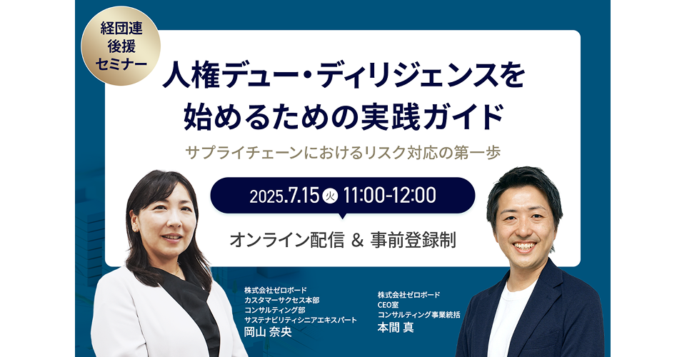
開催日: 7月15日(火)11:00~12:00 申込期日: 7月14日(月)14:00
オンライン
【経団連後援】人権デュー・ディリジェンスを始めるための実践ガイド~サプライチェーンにおけるリスク対応の第一歩〜
| 参加費 | 無料 |
|---|---|
| キーワード | 人権デュー・ディリジェンス |

2025年6月18日(水) 14:00〜15:00
オンライン
【経団連後援】統合報告書の価値を読み解く~投資家 × 支援現場 × データ、それぞれのリアルな視点から~
| 参加費 | 無料 |
|---|---|
| キーワード | 統合報告書, ESG |

2025年6月11日(水) 15:00-16:00
オンライン
(オンライン開催) これから始めるサステナブル調達 ~なぜ必要なの?何から始めるの? 基本を学べるセミナー~
| 参加費 | 無料 |
|---|---|
| キーワード | 気候変動, 人権問題, サステナブル調達 |


2025年5月14日(水)13:15-14:45
インテックス大阪 国際会議ホール
サステナブルマテリアル展(特別講演+ネットワーキングイベント)
『ラベル産業から「未来社会」を考えるー「資源循環プロジェクト」から始めるサーキュラーエコノミーへの転換』
| 参加費 | 無料 |
|---|---|
| キーワード | 資源循環, 水平サイクル |

2025年5月8日(木) 15:00-16:00
オンライン
EU炭素国境調整メカニズム(CBAM)とオムニバス草案の最新動向解説セミナー (オンライン)
| 参加費 | 無料 |
|---|---|
| キーワード | CBAM, オムニバス草案, 第三者検証 |

2025年4月15日(火)13:30-14:30
東京都千代田区大手町1-3-1 JAビル11F
第5回 資源循環プロジェクト公式Web説明会
| 参加費 | 無料 |
|---|---|
| キーワード | 資源循環, 水平サイクル |

2025年4月10日(木) 14:00-15:00
オンライン
GHG排出量算定の最新動向と実務ポイント解説セミナー (オンライン)
| 参加費 | 無料 |
|---|---|
| キーワード | GHG排出量削減, CSRD |

2025年3月19日(水)
オンライン
カーボンニュートラル達成に向けた海外の包装廃棄物・資源循環規制とリサイクル認証の動向
| 参加費 | 5,500円(税込) |
|---|---|
| キーワード | 包装廃棄物, 資源循環 |

2025年2月~5月 毎週金曜日 13:30~17:00
Teams
【SOCOTEC】2025年度CDP回答準備セミナー
| 参加費 | 1講座30,000円(4講座全て受講で120,000円) |
|---|---|
| キーワード | CDP, ESGレーティング |

令和 7年1月15日(水)13:30~16:25(13時開場)
三重県総合文化センター 多目的ホール(男女共同参画棟)
【資源循環プロジェクト登壇】令和6年度 三重県資源循環セミナー ~循環経済に向けた動静脈連携の可能性と期待~
| 参加費 | 無料 |
|---|---|
| キーワード | 資源循環, 水平サイクル, 再資源化事業等高度化法 |

2024年12/13、12/16、12/19、12/20、12/25(午前:10:00~12:00、午後:13:30~15:30)
オンライン
【SOCOTEC】各種ESG対応にかかる無料セミナー(CSRD| 気候移行計画|ESGレーティング)
| 参加費 | 無料 |
|---|---|
| キーワード | CSRD, 気候移行計画, ESGレーティング |

2024年12月12日(木) 11:00~18:00
エプソン丸の内 〒100-0005 東京都千代田区丸の内3-4-1 新国際ビル1F
CONNECT! plaplat day CE @エプソンスクエア丸の内
| 参加費 | 無料 |
|---|---|
| キーワード | 資源循環, 資源枯渇, 廃棄物削減 |

2024年11月27日(水)~29日(金)9:30~17:00
東京ビッグサイト 東1・2・3ホール(弊社ブース:東2ホール/ブースNo. 2E-25)
【Ultibatch™】「POWTEX2024(第25回国際粉体工業展東京)」
| 参加費 | 無料 |
|---|---|
| キーワード | 粉体, 造粒 |


2024年9月19日
オンライン
プラスチック材料の情報をすばやく取得 – グローバル材料データベース「ULプロスペクター」の活用方法
| 参加費 | 無料 |
|---|---|
| キーワード | UL PROSPECTOR®, 活用方法, UL |


2024年 9月11日(水) AM10:00~10:45 、2024年 9月12日(木) PM15:00~15:45
オンライン
webセミナー「EPEAT改訂のポイントを解説」
| 参加費 | 無料 |
|---|---|
| キーワード | EPEAT |


2024年7月17日(水)13:30~14:30
三井物産ケミカル㈱本店 及び Zoom
「資源循環プロジェクト」第4回公式Web説明会
| 参加費 | 無料(現地50名/オンライン450名 ※先着順、事前予約制) |
|---|---|
| キーワード | マテリアルリサイクル、資源循環 |


2024年5月31日(金曜)13:00~17:10
一社)難燃材料研究会主催・オンラインセミナー
2024年度 難燃・教育講座-基礎編
| キーワード | 難燃メカニズム, 難燃剤の種類, 開発動向, 配合処方, 試験方法 |
|---|
2024年05月30日(木)11:00~19:00
大阪産業創造館(6F)
CONNECT! plaplat day@大阪
| 参加費 | 無料 |
|---|---|
| キーワード | 組織のGHG算定、製品CFP算定・削減、オフセット |

2024年5月28日(火) ①11:00〜12:00 ②15:00〜16:00
オンライン
気候移行計画や削減目標設定に関する最新情報〜CDP回答や開示に向けて押さえておくべきポイントを解説〜
| 参加費 | 無料(各回 500名) |
|---|---|
| キーワード | 気候移行計画,削減目標設定,CDP回答 |

2024年5月17日(金) 13:00~17:30
慶應義塾日吉キャンパス 協生館2F 多目的教室1
IAF特別プロジェクト@IPF 2023 報告会
| 参加費 | 無料 |
|---|---|
| キーワード | プラスチック成形, 製造DX, カーボンニュートラル |

2024/4/8(月) 13:30~14:30
東洋紡㈱本社(大阪市北区)/Zoom
「資源循環プロジェクト」第3回公式Web説明会
| 参加費 | 無料(現地50名/オンライン450名 ※先着順、事前予約制) |
|---|---|
| キーワード | マテリアルリサイクル, マテリアルリサイクル |

2024年4月4日(木)15:00~15:50
オンラインセミナー(Webex)
誕生から40年、
ULTEM™樹脂が実現した高性能プラスチックの世界
| 参加費 | 無料 |
|---|---|
| キーワード | スーパーエンプラ, 高付加価値, CO2削減, 製品設計 |

2024/3/12(火) 13:00~16:00
日本バイオプラスチック協会主催・オンラインセミナー
最新のプラスチックを巡る環境について
| 参加費 | 2,000円 |
|---|---|
| キーワード | プラスチック規制, 海外動向, 海洋生分解性認証 |

2024年3月7日(木曜)~3月8日(金曜)
バイオプラスチックフォーラム主催・オンラインセミナー
バイオプラスチックによるサーキュラーエコノミーへの挑戦 〜加速する世界と今〜
| 参加費 | 3,000円 |
|---|---|
| キーワード | バイオプラスチック, 海外動向, 素材開発, 加工技術 |

2024年3月1日(金曜)13:00~17:10
一社)難燃材料研究会主催・オンラインセミナー
2023年度 難燃・教育講座-応用編
| 参加費 | 一般の方)25,000円、 会員・協賛団体の方)20,000円 |
|---|---|
| キーワード | 難燃材, 化学物質規制, 燃焼性試験, 防火性能, 海外動向 |

2024/2/27(火) 13:30~14:30
三井物産ケミカル㈱本店(東京都千代田区)/Zoom
「資源循環プロジェクト」第2回公式Web説明会
| 参加費 | 無料(現地50名/オンライン450名 ※先着順、事前予約制) |
|---|---|
| キーワード | マテリアルリサイクル, 資源循環 |


2023年12月13日(水曜)10:00~19:00
TOKYO TORCH 常盤橋タワー3F
CONNECT! plaplat day
| 参加費 | 無料 |
|---|---|
| キーワード | 組織のGHG算定, 製品CFP算定・削減, オフセット |

